Forum Replies Created
list of topics you have created till now.
-
-
Thanks Serkan!
Well strange… It was a brand new install of Chrome (same version as what you used) and I even cleared the cache and checked again but then today I cleared the cache again and now it looks fine – so sorry, looks like everything is fine. Weird!To Ahmet and Serkan –
The update finally worked today!
This has not been a good experience.
Just updating the theme, and I had to go thru all of this for weeks, just to get my site back to normal (the way it was before the update)Hopefully you guys can keep this in mind and going forward you will do updates in a way that will not negatively effect our existing sites.
Also, not sure what was going on with the envato update plugin or with envato, but hopefully you are talking with them to see what happened and to make sure that it doesn’t happen again.
Thank You!
Steve
Hi Ahmet and Serkan –
I’ve been away traveling. Just got back and tried the 1.8.4 update again in wordpress and still getting the same error!
What is the status of this and why is this taking weeks to get fixed?
Thank You!
Yes – it is version 2.0.0
I filled out a support ticket with them earlier today as well, but have not heard anything back!
Thanks!
Hi Serkan –
I’m still trying to get our site back to normal and full-width images on tablet and mobile (with sidebar) since doing the update to 1.8.1Just tried again today and still getting —- “An error occurred while updating TheBlogger: Download failed. cURL error 6: Could not resolve host: marketplace-downloads.customer.envatousercontent.com”
I’m waiting for this to be resolved. Can you please post when this is for sure fixed and I can finally do the update?
Thank you!
Hey Serkan – I’ve been traveling – finally got back and thought for sure this would be fixed. Looks like there is even another update (1.8.4)
Tried to update the theme and still getting an error!
Can you please get after Envato or whomever is responsible and see that this gets fixed promptly? I do not want to do a manual update – seems too scary!
Thank you!
Thanks guys! However, I tried to do the update (1.8.3) and got this error:
“An error occurred while updating TheBlogger: Download failed. cURL error 6: Could not resolve host: marketplace-downloads.customer.envatousercontent.com”
I tried several times and kept getting the same error.
– Steve
Hi Serkan –
Noticed that there was a theme update:
v1.8.2 – 23 April 2018
– improved: main slider image size
– improved: one click demo import– Does this update address the full width images (w/sidebar) issue?
If not, when will that be fixed?As we have been talking about (more details) on the theme updates – a perfect example is in the latest 1.8.2 update:
– improved: main slider image size
What does that mean exactly? What is improved? What is changed?Thanks for your help!
Steve
OK thanks Serkan! Let me know.
Hey – I just noticed that our sidebar went away on category pages, search result etc.. I see that there is an option in the customizer now under sidebar – blog archive sidebar – need to set to ‘yes’
Seems like you guys need a better way to communicate these changes that are going to effect our live websites with a theme update. Especially on a update that is going change so much the way our sites are going to function.
Obviously we love that you keep trying to improve the themes and keep doing updates, but sure might be good to have some better documentation on the theme updates (more detailed). I know you have the change log on the site but that doesn’t begin to describe all the changes.
Thanks!
Thanks Serkan!
Actually what ended up working is:
– For the home page featured area –
.main-slider-post .cat-links a:not(:first-child) {
display: none; }– For single posts –
.single-post .cat-links a:not(:first-of-type) { display: none; }– I see now that this code is for the the first post underneath the featured area on the home page (which we didn’t need to change)
.first-full > article:first-child .cat-links a:not(:first-of-type) {
display: none; }Thank you!
So question – Why did this get changed in the theme update so that we have to put in this CSS code to go back to the way it was?
As far as the issue with the full width images. This is a real bummer that this got changed in the update. I sure hope this gets resolved quickly. This feature was one of the main reasons we chose ‘the blogger’ theme. It took a lot of back an forth last time, to get you guys to understand (the fact that it was posts with a sidebar) but finally you came out with an update.
Here is the original thread:
http://www.pixelwars.org/forums/topic/sidebar-on-desktop-and-full-width-images-on-mobile/Thanks for all your help Serkan!
Let me know if it is going to take a while to fix this cause maybe then we should go back to the previous version?
– Steve
Thanks Serkan, but you didn’t address the problem with multiple category links showing on the top of single posts. The second bit of code didn’t work.
Also, for the full width images, you are showing an example on a full width page. Mine are on pages with sidebar. And it definitely stopped working with the 1.8.1 update. If I remember correctly, I bugged you guys about this and so you guys included it in an update at one point to make the full width photos show up on mobile and tablet when using post with sidebar.
thank you!
ALSO –
Just noticed that all the photos in single posts that we marked “full” (image CSS class – in image details) are no longer full width for all our posts!– Why are we having to go to you for so many fixes for this update?
Thanks for your help!
– Steve
Thanks Serkan –
– The code for the featured area (home page) worked but the code for the top of the single post didn’t seem to change anything even after clearing cache. Still showing multiple category links.
– Also, how do you designate which category link shows up there (if you have assigned multiple categories for the post) I thought it would have been there on the categories section of the edit post area where it says “make primary” but that does not seem to effect it.
– Our ad management team fixed the sidebar ad problem.
Thank you!
Sorry – here is the website https://www.decoratingyoursmallspace.com
I just did the latest update 1.8.1
And now the parallax effect is totally gone and the top menu bar is double! Also Titles are gone from featured area! I have seen quite a few other people are saying the same thing on the forums, but I see no solution posted.
Update: Now this morning (maybe because I cleared my browser cache), parallax effect seems to work and double top menu is gone but multiple category titles are shown in the featured area and top single post when there used to be just one showing.
Also, our ad management added a special sticky side bar ad (at end of side bar) now ad disappears as soon as you scroll down to that ad.
Can you please help? Thank you!
– Didn’t know it I should post here or start a new topic, so I will post a new topic as well
Hi Serkan –
I tried that and still didn’t work.
So I ended up Installing Yoast SEO plugin which has the open graph functionality built in and that seems to be working fine!update: Disregard this last question! ESSB is just too un-user friendly and complicated.
We are going to try and use “add this” somehow.
I came up with this code to make some space at the top of the page – it seems to work.
You see any problems with this code?@media screen and (max-width: 991px) { .menu-wrap {
margin-top: 35px;
} }Thanks!
Hey Serkan –
I think there has been a bit of a mis-communication on this.
I don’t think this is a plug-in specific issue. It seems all the social sharing plugins out there seem to cover (go over the top) of content when using a top or bottom share bar. Right now we are using “addthis” and that is what the screen shot is of.
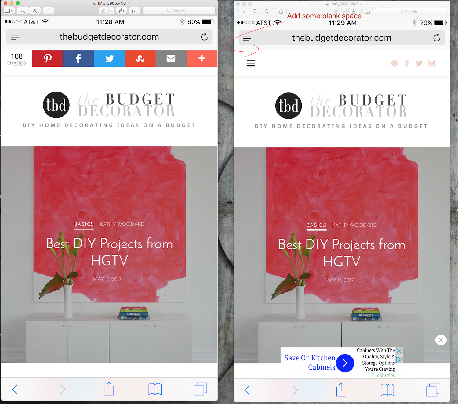
I thought for sure that there would be some simple css that you would easily come up with, that would just simply create some extra padding (blank space) at the top, where the share bar could go without covering up the content at the top of the page. (on mobile and tablet only)
So that is not possible?Thanks for your help!
hey Serkan –
The problem is that I don’t want to add the top share bar until after I have a way to add some blank space to the top. If I do, it will cover the content at the top of the sites.
If there was a way to just add some blank white space at the top (on mobile and tablet only) by adding some padding or something to the header that would be great.
Right now we just have ‘addthis’ floating share bar on left for desktop only.Here is a link to a screen shot of with and without the top ‘addthis’ share bar and you can see how it covers up the menu icon and follow icons at the top of the page.
Hoping there is some easy css to add to just add the extra space at the top. and drop down the whole page.Thanks!
Ok thanks Serkan!
Thank you Ahmet!
And like I said it is even worse on Firefox! So I really hope it can be improved.Thanks!
Safari is what I use. But I’ve checked it on Firefox as well and it is the same.
Tried disabling smoothscoll and did not notice any difference.
It just is not as smooth as the other websites that I got o that use some sort of parallax effect.Thanks!
So somebody on the wordpress forum said this:
Add below code to your theme function.php file.
add_filter( ‘the_content’, ‘attachment_image_link_remove_filter’ );
function attachment_image_link_remove_filter( $content ) {
$content =
preg_replace(
array(‘{<a(.*?)(wp-att|wp-content\/uploads)[^>]*><img}’,
‘{ wp-image-[0-9]*” />}’),
array(‘<img’,’” />’),
$content
);
return $content;
}Does that seem like it would work? If so, would I put it in the function.php file that is in the blogger – child theme folder? And would that be after the line that says “custom functions”?
Thanks!
I will. Waiting for a response from wordpress!
Thanks Serkan – I’ll try that!
Hey guys!
Finally have time to investigate this problem again.
For some reason, when we changed our 3 blogs over to ‘the blogger’ theme, it looks like something happened and that setting ( link to ) got changed to ‘media file’ on many of the images. We had them all on ‘none’. We have probably over 1000 images and hundreds of posts, it is virtually impossible to go back and change them one by one! I’ve searched all over for a bulk or global way to change all of them at once but can’t find anything. I can only find how to change the default for new images.
Do you know of any way to do this in bulk? Is there a way to edit the database or something? Any help would be appreciated. We want to change them all back to ‘none’.Thanks!
Steve B
Participant10 May 2017 at 01:14Posted in : Slider – featured area – view post button issuesThanks Serkan – that helped!
Yes – that is so much better! The circle is now a oval, but guess that is ok.
Thanks Serkan!Hi Serkan,
Actually all three sites –http://www.thebudgetdecorator.com
http://www.decoratingyoursmallspace.com
http://www.thegardenglove.com/Could you do something like this photo, to give you more surface area to be able to click on:
http://www.decoratingyoursmallspace.com/wp-content/uploads/2017/04/pagination.jpg
Thanks!
Actually now that I test it out a little more, the numbers really are too small of an area to hit with your finger on a mobile device (even on tablet). Takes several attempts before you can finally hit it just right. The “next” link is ok.
Hoping you can eventually improve this?! Maybe put a circle around the numbers (not shaded) as well and have the whole circle be clickable? And then the page you are on would be shaded?I know there is the old style – (older/newer) but would really rather not use that.
Thanks!
Participant27 April 2017 at 20:06Posted in : featured area – making widget heights the sameok thanks Sekan! Code works good!
Thanks Serkan!
Thanks Serkan!
That helps! Thanks!
Participant27 April 2017 at 01:53Posted in : featured area – making widget heights the sameThank you Serkan!
I did some tweaking. I think I am learning (a little)Here’s what I have now:
@media screen and (max-width: 767px) { .link-box { width: 50%; } }
@media screen and (max-width: 991px) and (min-width: 767px) { .slider-box { width: 50%; } }
@media screen and (min-width: 767px) { .post-wrap { padding-top: 117%; } }
.ratio-16-9 .post-wrap { padding-top: 56.25%; }
Everything looks good except a couple things:
1 – (on phone only) can we make the link boxes (“home gardening” & “outdoor rooms”) so the height is less – (16×9 ratio maybe) – I still have this code in (carried over from the 1st site that I did) >> .ratio-16-9 .post-wrap { padding-top: 56.25%; } and thought that might have fixed it but I don’t think it is doing anything!
2 – Would there be a way to make all the spacing the same? – see photo
http://tgg.wpstagecoach.com/wp-content/uploads/2017/04/Screen-Shot-2017-04-26-at-3.44.03-PM.jpgThanks!
Perfect! Thanks Serkan!
Yes! – that worked – thanks Serkan!
Thanks Serkan.
I tried it and it didn’t seem to do anything.
Also I noticed that even on desktop, at somewhere around 1060px, the images get smaller.
So it looks like to me (the way it is now) is that the images are a good size up to around 670px wide – then they get smaller (too small) all the way until around 1060px then switch back up to the larger good size.
So is kind of weird that they switch to a smaller image for that middle area. Should just stay the same size I think.Thanks!
Thanks Serkan – works good!
Hoping that you come up with an email subscribe widget that you have styled to work in that footer area that is more than just mailchimp! For us it is Aweber.
Thanks!
oh – Site is live now – http://www.thebudgetdecorator.com
Crap! Sorry Serkan, still not changing anything on phone and tablet!
Thanks!
Participant12 April 2017 at 21:36Posted in : Intro Description font size (on tablet & phone)Thanks Serkan! Works good!
Yeah strange – that code made the border 1px on desktop – thank you! But yeah, it doesn’t change the rounded ends and top shadow that you see in that screen shot on iPhone and iPad! Any other ideas?
That at least made the email input area the same width as the subscribe button. So that is better. I am using this code to make the widget an acceptable width:
.footer-subscribe .layout-medium,
.footer-subscribe .layout-medium .link-box {
max-width: 490px;
}If I don’t do that code, the widget form stretches across most the page and is super wide. I really don’t know that much about css, so was that the proper way to keep it only 490px wide?
I was just wondering if there was anything (code wise) that would say ignore all the css that is built-in for just that section, so that then would not interfere with whatever I put in there.
But if that is not possible, the only other thing that would be cool to do would be to be able to make that email input area like the same widget that is in the sidebar. The email word is black and bold and it should be light grey and centered.
Thanks for all your help!
Thanks Serkan! Works great!
update: I figured out the last problem (not showing on about page). That is ok now.
Works great Serkan – thanks much!
Perfect, thanks so much!
Sorry, one more thing – how about making the 4 link boxes height a little less so that they are more like rectangles instead of squares? Is that possible?Thank you!
Checking the discussion box and then unchecking “allow comments” Worked great.
Thanks Serkan!